




Decorating a nursery feels like a win. The crib goes in. The shelves get mounted. It’s easy to get distracted by the cute patterns and the tiny socks. But there’s a catch. The colors you pick do more than just look good. They impact your baby’s health. They shape their mood. They even influence their mental and physical growth.
Most parents treat paint swatches like a fashion choice. They aren’t. This is environmental psychology. You’re building a sensory habitat. The wrong shade can overstimulate a nervous system. The right one can soothe it. So, how do you decide which paint to buy? And why does it matter?
Let’s look at the science behind the palette. We need to move past “pink for girls, blue for boys” nonsense. That’s not how development works. We need to look at light reflection, emotional association, and long-term comfort.
The Science of Color Perception in Infants
Newborns don’t see the world in full color. Not at first. Their vision is blurry. They see high contrast best. Black and white. Bold shapes. But within a few months, color vision kicks in. Red is usually the first hue they detect. Then green. Then blue.
This matters because your paint choices will be seen constantly. Once the eyes develop, the brain processes these signals non-stop. Bright, saturated colors trigger alertness. They demand attention. Pastels do the opposite. They signal safety. They lower heart rates.
“Environment shapes behavior. A chaotic visual field can lead to a chaotic mind.”
If you want a room that encourages sleep and calm, avoid neon. Avoid high-gloss finishes that reflect too much light. Matte paints are better. They diffuse light softly. They reduce glare. Glare is stressful. It keeps the brain on edge.
Best Baby Room Color Combinations
So, which hues work? It’s not about one single color. It’s about combinations. You need a primary tone. A secondary accent. And plenty of neutral space for toys and bedding to pop.
Here are three proven palettes for development:
-
Soft Greens and Warm Greys
Green is linked to nature. It’s restful for the eyes. It doesn’t overstimulate. Pair it with warm greys or beige. This creates a grounded feel. It’s great for a room that needs to serve double duty as a play area later on. Green helps with focus. Grey adds sophistication. Together, they balance energy and calm. -
Pale Blues and Whites
Blue is often cited as the most calming color. Studies suggest it lowers blood pressure. Pale blue walls with white trim feel airy. They make small rooms feel larger. Light floods in. This is a classic choice for a reason. It’s safe. It’s versatile. It doesn’t date quickly. -
Warm Yellows and Creams
Yellow represents happiness. But too much yellow is anxiety-inducing. Keep it subtle. Use butter yellow or pale gold. Mix with creamy whites. This adds warmth without the harshness of orange. It’s inviting. It feels cozy. Good for north-facing rooms that lack sunlight.
Colors to Avoid in the Nursery
Not all colors are created equal. Some are actively harmful
The Color Code: Blue, Pink, Yellow, and Green in Nursery Design
Choosing wall colors for a nursery feels like more than just an aesthetic decision. You’re painting the backdrop for your baby’s first months of life. The science behind how infants process color is specific, especially regarding vision development and behavioral cues. Here is how four major hues impact the room’s function.
Why Blue is the Calming Standard
Blue dominates nursery paint charts for a reason. It acts as a natural sedative. Exposure to blue light helps regulate circadian rhythms, making it easier for babies to fall asleep and stay asleep. This isn’t just anecdotal; the calming effect of blue on the nervous system is well-documented.
Beyond sleep, blue supports mental development. It creates a serene environment that encourages focus and reduces overstimulation. If you are dealing with a colicky infant or a parent struggling with sleep deprivation, blue walls are a practical tool.
The Pink Controversy: Aesthetics vs. Science
Pink is traditionally associated with girls’ rooms. It evokes feelings of warmth, love, and comfort. However, the psychological impact is less clear-cut than with blue.
Research does not confirm that pink has a direct effect on sleep patterns. It doesn’t lower heart rate or induce drowsiness like cool tones do. If you choose pink, you are prioritizing emotional warmth over physiological regulation. It works best in moderation or as an accent rather than a dominant background if sleep is your primary concern.
Yellow: Energy and Visual Stimulation
Yellow is vibrant. It is energetic and cheerful. For a baby’s developing brain, yellow offers cognitive benefits. It can stimulate mental activity and physical engagement.
There is also a visual component. Yellow is one of the first colors infants can perceive clearly. It aids in early eye development by providing high contrast and brightness. However, too much yellow can be overstimulating. It may lead to fussiness in some babies. Use it for accents or lower walls to keep the energy manageable.
Green: Nature’s Balance
Green bridges the gap between calming and stimulating. As the color of nature, it reduces stress while remaining visually engaging. Like blue, green promotes relaxation and helps stabilize sleep cycles.
It also supports eye development. Green light is easier for the human eye to process than red or blue, reducing strain. This makes it an excellent choice for a room where you spend a lot of time reading or soothing your baby. It is a sustainable choice for mental well-being and visual health.
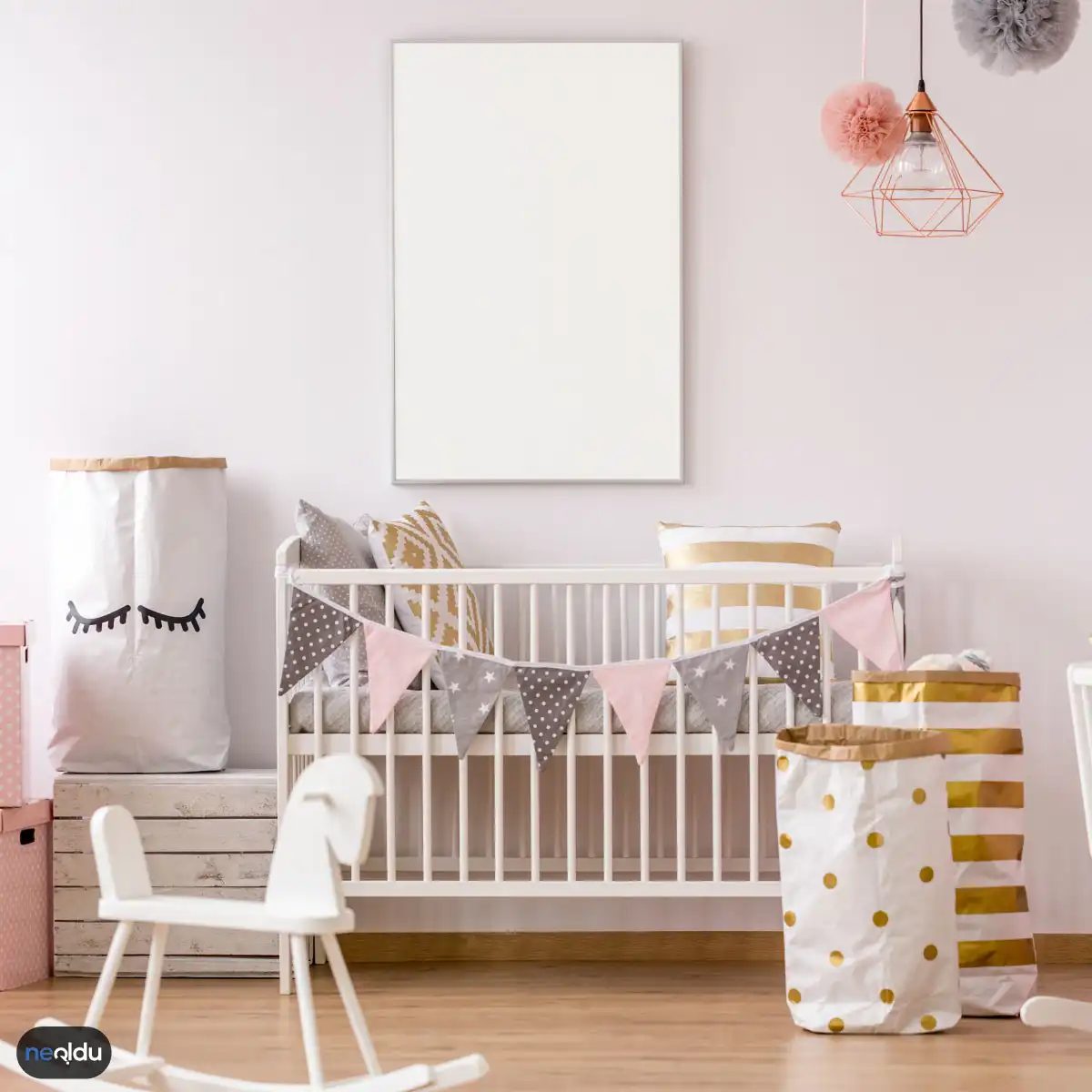
Renk seçimi, boya alırken ya da duvar kağıdı ararken takılıp kalınan o an. Sadece estetik değil, bebekin ruh hali ve uyku düzeniyle de doğrudan ilgili. İşte temel üç renk ve neden bu kadar popüler oldukları.
Neden Beyaz Öncelikli Tercih?
Bebek odalarında en çok tercih edilen renk beyaz. Temizlik ve saflık hissi veren bu ton, her dekorasyon tarzına uyum sağlar. Pratik bir avantajı var: Beyaz, diğer tüm renklerle harmanlanabilir. İsterseniz duvarları beyaz, döşemeleri pastel tonlarda tutabilir, isterseniz aksan duvarına cesur bir renk ekleyebilirsiniz. Bu esneklik, ileride odanın dönüşümünü kolaylaştırır.
Turuncu Enerjisi ve Dikkat Edilmesi Gerekenler
Canlı ve enerjik bir atmosfer arıyorsanız turuncu iyi bir seçenek. Bazı araştırmalar, turuncu tonlarının zihinsel gelişimi desteklediğini öne sürüyor. Ancak burada bir uyarı var. Aşırı kullanım, özellikle yatak odalarında uyku düzenini bozabilir. Turuncu, uyarıcı bir renktir. Gündüz oynama alanlarında veya oyuncak raflarında sınırlı olarak kullanılabilir. Ama uyku odasının ana rengi olmamalı.
Bej: Sakinlik ve Doğanın Sesi
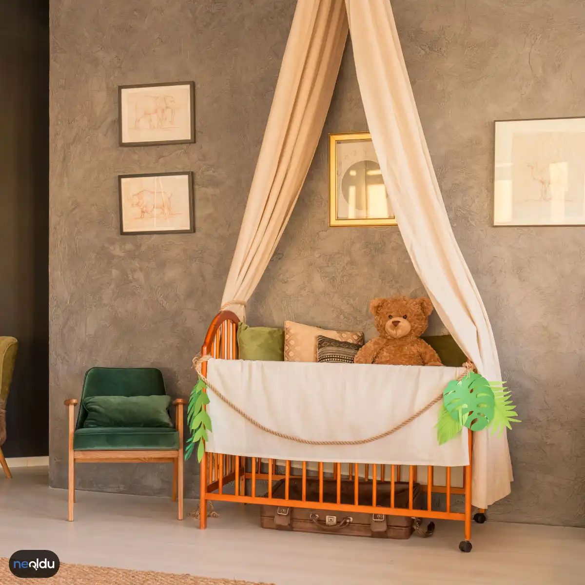
Bej, son yıllarda bebek odalarında sıkça gördüğümüz, huzur veren bir ton. Diğer renklerle kolayca uyum sağlar. Sakinleştirici etkisi sayesinde bebeyi sakinleştirir. Ayrıca doğal bir görünüm kazandırır. Ahşap detaylar, pamuklu kumaşlar ve keten dokularla birleştiğinde oda daha organik hissettirir. Bej, göz yormayan bir zemin oluşturur. Üzerine eklenen renkler daha belirgin ve canlı görünür.
Bebek Odası Renk Seçimi Nasıl Olmalı?
Renk seçerken sadece neyi sevdiğinize değil, neye ihtiyacınız olduğuna bakın. Uyku düzeni, oyun alanı ihtiyaçları ve temizlik kolaylığı gibi faktörleri göz ardı etmeyin. Beyaz esneklik sunar. Turuncu enerji verir ama dikkatli kullanılmalıdır. Bej ise denge ve sakinlik sağlar. Hangi renkleri birleştireceğiniz, odaya vereceğiniz işleve göre değişir.
Why Color Matters in a Nursery
Colors do more than just fill empty wall space. They set the tone for the room. For a baby’s nursery, this means stability. It means rest. It means safety.
But why does color matter so much?
It’s not just about aesthetics. It’s about biology.
A baby’s senses are raw. Overstimulation is real. Too much contrast. Too much vibration. Too much visual noise. It can trigger cortisol. It can disrupt sleep.
Colors influence mood. Colors influence behavior. Colors influence development.
A well-chosen palette supports growth. A poorly chosen one hinders it.
You’re not decorating a gallery. You’re building a habitat.
Think about the environment your child will spend most of their waking hours in. Think about the walls that surround them during their first critical months.
Colors shape perception. Shapes development. Shapes behavior.
It’s not magic. It’s psychology. It’s physiology.
Choosing Pastel Tones
Pastels are the gold standard for nurseries. They’re calming. They’re soothing. They’re gentle on developing eyes.
Why pastels?
Because they reduce visual stress. They promote relaxation. They encourage sleep.
Soft blues. Gentle greens. Pale pinks. Muted yellows. These shades create a serene atmosphere. They don’t shout. They whisper.
They also support circadian rhythms. That’s the body’s internal clock. It regulates sleep. It regulates wakefulness.
A pastel palette helps maintain that rhythm. It doesn’t overstimulate. It doesn’t overwhelm.
It’s the opposite of high-contrast black and white. That’s for newborns. For older babies, it’s pastels that work best.
They’re safe. They’re effective. They’re proven.
Using Multiple Colors
One color is boring. Multiple colors are engaging.
But don’t go overboard. Balance is key.
A single hue can feel sterile. A chaotic mix can feel chaotic. Neither is ideal.
The goal is vibrancy. Controlled vibrancy.
Introduce secondary colors. Accent colors. They add life to the room. They make it interesting. They make it inviting.
For babies, this variety stimulates cognitive development. It encourages exploration. It encourages curiosity.
Think of it as a visual playground. Safe. Structured. Stimulating.
Use a primary color for the walls. Add secondary colors through bedding. Add accent colors through toys. Books. Rugs.
It creates depth. It creates interest. It creates a space that grows with your child.
Coordinating Harmonious Colors
Harmony isn’t just an aesthetic choice. It’s a developmental necessity.
Clashing colors create visual tension. Harmonious colors create visual peace.
Which colors work well together?
Analogous colors. They sit next to each other on the color wheel. Blue and green. Orange and yellow. Red and purple.
They create a unified look. They create a cohesive space. They reduce visual noise.
Complementary colors can also work. Blue and orange. Red and green. But use them sparingly. They create contrast. High contrast can be stimulating.
The goal is harmony. Balance. Unity.
A harmonious palette supports mental and physical development. It reduces stress. It promotes focus. It encourages calm.
It’s not
How Nursery Colors Shape Infant Development
You’re painting walls. You’re picking paint swatches. The goal isn’t just aesthetics. It’s biology.
The colors you choose for a baby’s room do more than look good in photos. They actively influence sleep, mental growth, physical development, and emotional stability. This isn’t just decor. It’s environmental design for a developing brain.
Sleep Regulation and Color Psychology
Blue and green are your best friends here. These hues act as natural sedatives. They help regulate a baby’s circadian rhythm. When the room is bathed in these tones, relaxation follows.
Pastel shades work similarly. They don’t scream for attention. They whisper calmness. If your priority is getting your infant to sleep longer, stick to cooler, softer palettes. Bright lights and harsh colors disrupt this process.
Stimulating Mental and Physical Growth
Once the baby is awake, the environment needs to shift.
Vivid colors drive mental engagement. Yellow, in particular, is linked to cognitive stimulation. It wakes up the brain. Blue still plays a role here, offering a counterbalance of calm without inducing drowsiness.
For physical development, eye health matters. Yellow and green are recommended to support visual tracking and development. If you want to encourage movement and play, introduce brighter, more energetic tones. The contrast between a restful blue sleep zone and a stimulating yellow play area can be effective.
“Different colors add vitality to the nursery and can positively impact a baby’s mental and physical development.”
Emotional Impact: Pink, Blue, and Pastels
Emotional development is subtle but significant.
Pink is often cited as a trigger for feelings of love and affection. It creates a warm, nurturing atmosphere. Blue, as mentioned, instills a sense of security and calm. It’s a grounding force.
Pastel tones bridge the gap. They support emotional growth by providing a non-overstimulating backdrop. This allows the baby to process emotions without sensory overload.
Practical FAQs for Parents
Which color is most commonly used in nurseries?
Blue remains the top choice. It’s universally associated with calmness and is safe for both boys and girls. It’s a neutral ground that doesn’t pigeonhole the child before they even speak.
Why prefer pastel tones over bright primaries?
Pastels protect developing eyes. They regulate sleep better than high-contrast brights. They reduce visual stress. You want a room that soothes, not one that exhausts.
Is it important to mix different colors?
Yes. Monochromatic rooms can feel sterile. Different colors add depth and vitality. This variety supports cognitive development by providing visual stimuli that encourage exploration and focus.
How do specific colors affect emotional growth?
Pink encourages affection. Blue builds trust and calm. Pastels generally support positive emotional regulation. The key is balance. Too much of any single hue can become overwhelming.
What should you consider when choosing nursery colors?
Look beyond gender stereotypes. Consider your baby’s temperament. Some infants are highly sensitive; they need muted tones. Others thrive on contrast.
Use complementary colors. Don’t just paint the walls. Incorporate colors through wallpaper, bedding, and accessories. This allows for easy updates as the child grows. Keep the base neutral if you’re unsure. You can swap out textiles cheaper than you can repaint.
The paint dries. The baby grows. The colors you choose today set the stage for their earliest memories. Choose wisely. Or, choose comfortably. There is no single right answer. Just what works for your family’s rhythm.