


Many homeowners approach bathroom design with either a preference for spa-like neutrals or a desire to experiment with bolder colors. However, certain paint choices consistently lead to regret, according to interior designers. Melanie Grabarkiewicz, a professional designer, highlights four common mistakes that can make a bathroom feel uninviting or even unpleasant.
Cool-Toned Blues
Avoid cool-toned blues, as they can cast a dull light on both the room and the person looking in the mirror. These shades may be unflattering to skin tones and lack warmth, especially in spaces where you start and end your day. Warmer, softer tones are more likely to create a calm and restorative environment.
Stark Gray or White
The trend of all-gray bathrooms is outdated. Stark gray or white can make a bathroom feel too clinical, especially under cool LED lighting. The shift towards warmer tones in tile and stone suggests a preference for inviting neutrals. Consider whites with subtle undertones of cream, taupe, or blush for a more welcoming atmosphere.
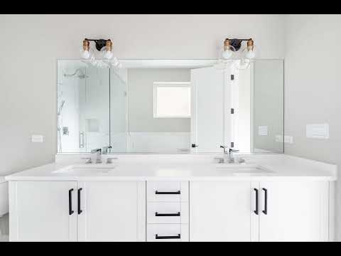
Crisp, Bright White
Although seemingly ideal for a clean aesthetic, crisp, bright white can feel harsh and unpleasant in practice. A warmer white is an easy fix, maintaining brightness while achieving a polished, refined look. Pale neutrals with hints of creme or beige are also effective alternatives. To add depth and personality, experiment with gentle patterns or moody shades like inky blue or hunter green.
Deep Color Drenching
Dark, color-drenched bathrooms gained popularity with the rise of dark academia, but often fall flat in reality. People underestimate the amount of light needed to make a dark bathroom functional. If you want to try this aesthetic, a powder room is a better fit, as long as you balance the rich tones with well-placed lighting. However, if your primary bathroom is where you get ready, dark walls may not be practical.
In conclusion: Choosing the right paint color in a bathroom can dramatically affect its mood and functionality. Designers recommend avoiding cool-toned blues, stark grays, overly bright whites, and deep color drenching to create a space that is both aesthetically pleasing and inviting.


