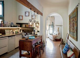





Color is fun. Really fun. You get to play with sage green cabinets and tuxedo palettes without thinking too hard. But if your kitchen is smaller than your dreams, some colors work against you. They shrink the room. Literally.
We asked designers to point out the traps. The hues that make a cozy kitchen feel like a closet. And since we hate unnecessary trips to the hardware store, we also found the fix. Alternatives that keep the mood but open up the floor plan.
The Problem With Navy Blue
Dark walls add contrast. That’s true. Especially next to blond wood or bright white cabinets.
But intensity overwhelms a small footprint. Amy Wax, a color specialist, puts it plainly.
“The intensity of that contrast in such a quick space can be overwhelming… honestly distracting for such a small room.”
Navy is popular. Everyone loves it. It’s safe. Universal. But maybe not in your 10-by-10 kitchen. If navy feels too heavy, try slate blue. Or a blue-gray. Softer. Same family, less visual punch. Wax calls it “ever-popular blue with a softer.” It lowers the contrast but keeps the vibe.
Charcoal Gray: Not So Neutral
Charcoal looks bold. It screams design intent. It’s also a black hole for light.
Dark gray absorbs brightness. The room doesn’t feel striking. It feels confined. Whether it’s on the cabinets or every wall, the effect is the same. The space shrinks.
Need an exit? Light neutrals. Lots of them.
“From beiges to light grays… taupe… the world is your oyster.”
Beige, tan, warm caramels. They push the walls out. They give the eye room to breathe. Charcoal pulls it in. Pick the lighter path if you hate feeling boxed in.
Greens That Weight Down
Forest green. Emerald. Rich, deep, dramatic greens.
They smell like nature. They look expensive. Eddie Maestri, an interior designer, warns though.
“Without natural light… these deeper greens can weigh down a Space.”
Does “weigh down” sound comfortable? It doesn’t. If your windows aren’t pouring sunlight into the room, the green becomes a curtain. A thick, suffocating curtain.
Swap it for muted sage. Farrow & Ball’s Mizzle. Sherwin-Williams Sea Salt. They feel grounded. Serene. But they leave the room visually open. Wax agrees. A blue-green or a soft sage works too. Less drama, more space.
Red Alerts
Ruby. Scarlet. Burgundy.
Dark reds act like magnets for your eyes. They make walls feel closer together. The ceiling feels lower. The air gets thick.
Wax suggests earthier tones. Rust. Terra cotta. These reds feel organic. They don’t crush the room.
Want more grace? Salmon pink. Creamy white accents. They keep the warmth without the weight.
Deep Slate Isn’t One-Size
Tuxedo kitchens love deep slate. It’s sleek. It’s modern.
It also eats light. Maestri notes these “inky tones” are elegant sure. But in a tight space they close in on you.
Can’t give up gray? Fine. Change the value.
A warm greige does the job. Benjamin Moore’s Revere Pewter. It adds depth. It doesn’t darken the room like coal would. It plays with warm and cool tones alike. Flexible. Breathable.
Maybe the best paint choice is the one that doesn’t stare you back.